Divi Pie Chart Module
The Divi Pie Chart Module allows you to add visually appealing and interactive pie charts to your WordPress site using Divi Builder. Easily add pie chart items with custom labels, values, background colors, and border colors to represent data clearly and creatively. It's a great way to present stats, comparisons, or any data-driven visuals that elevate your Divi Theme design.
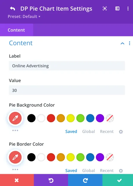
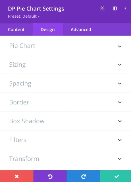
Easy and Intuitive Settings
Visualize Your Data Effortlessly
See how you can quickly configure pie chart segments, colors, labels, and values in the module settings. These controls give you full creative freedom to build engaging pie charts that enhance your Divi-built pages.
Present Data with Style and Clarity
Perfect for showcasing business analytics, survey results, budget allocation, or any dataset needing a clear, colorful breakdown. This module turns raw numbers into attractive visuals that engage your visitors and help convey your message effectively.
Marketing Channel Distribution Overview
Understand how different marketing channels contribute to your overall business growth and customer acquisition. This visual breakdown highlights the effectiveness of key channels, helping you identify where your audience comes from and which strategies generate the best results. Use these insights to optimize your marketing efforts and maximize return on investment.
Ice Cream Flavor Popularity
Discover our customers' favorite ice cream flavors and see how each delicious scoop contributes to overall popularity. This chart highlights the most-loved flavors, helping you understand customer preferences and trending dessert choices.